7 Basics of Portrait Style Florals - and Photography
As florists, artists and arrangers of beauty, the main way we attract attention - and potential new clients - is through beautiful visuals. Content creation can feel overwhelming, but it can also be fun when done in your own way.
Focusing on portrait images (rather than landscape) is essential to be shared and seen easily when so much of what we see is on own phones - Instagram and Pinterest priotrise portrait photos over landscape, pretty much always.
With this in mind, and the fact I love a “portrait style arrangement” chat about the basics of arranging portrait style flowers and photography…
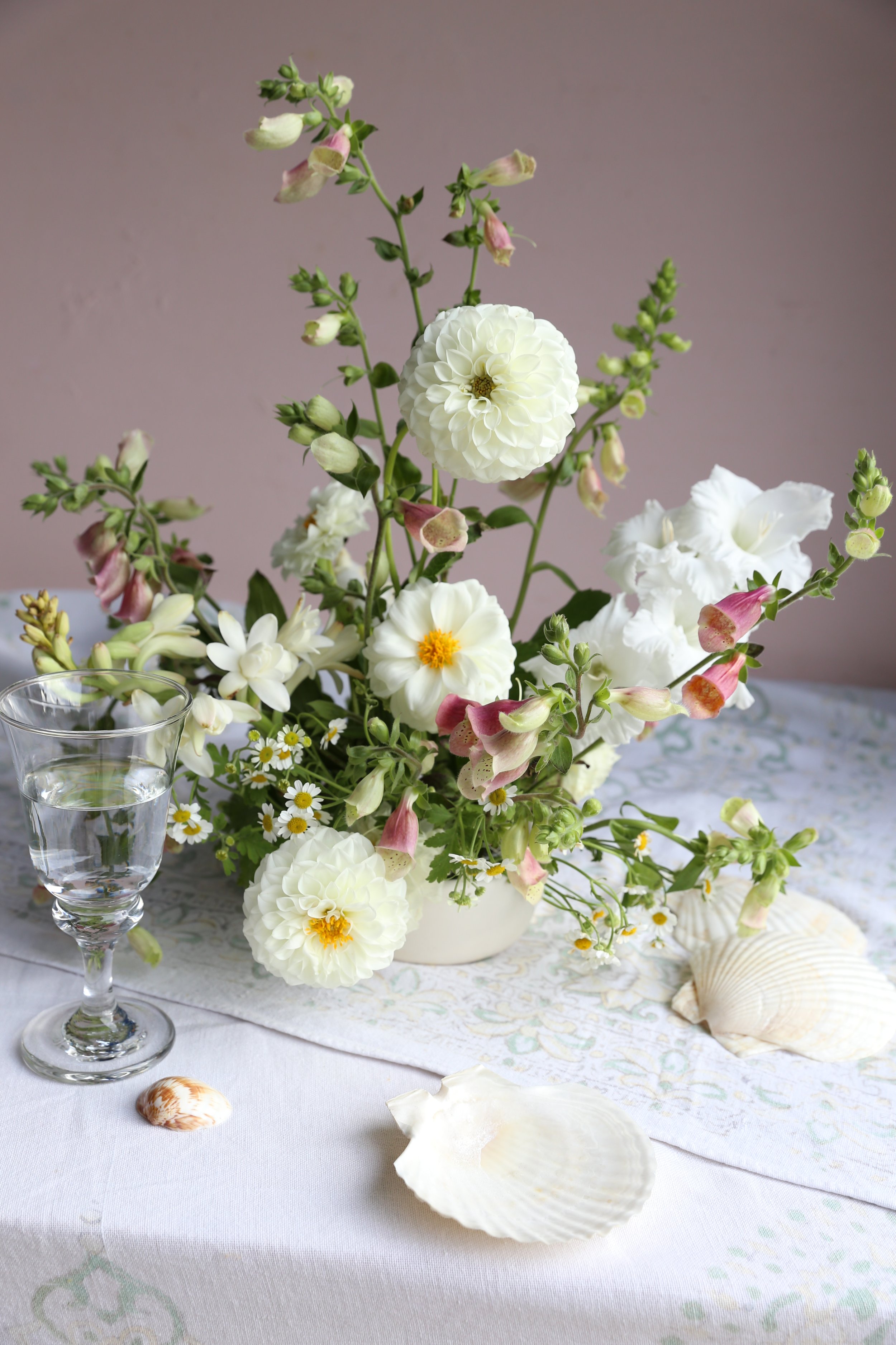
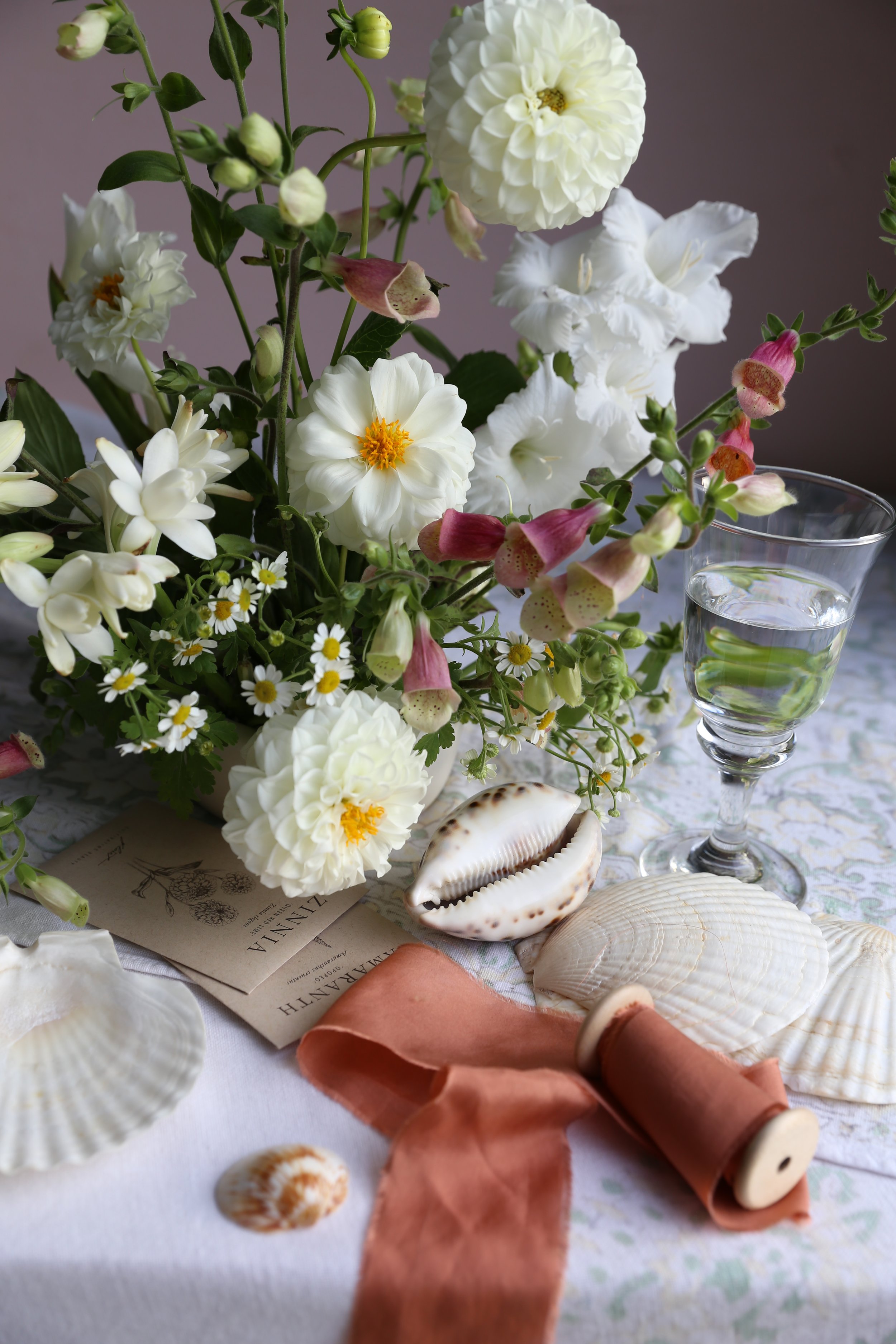
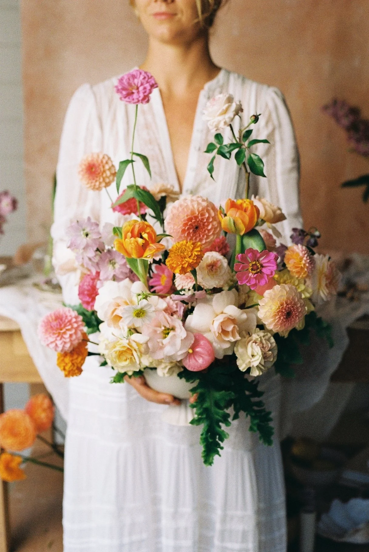
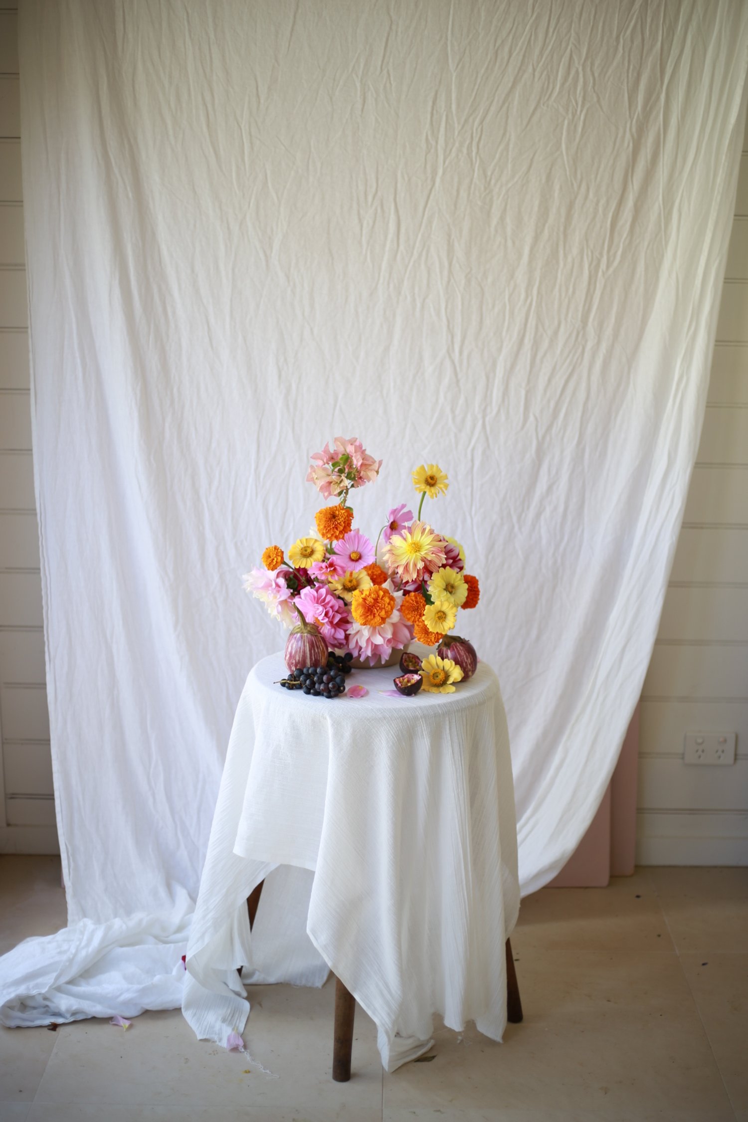
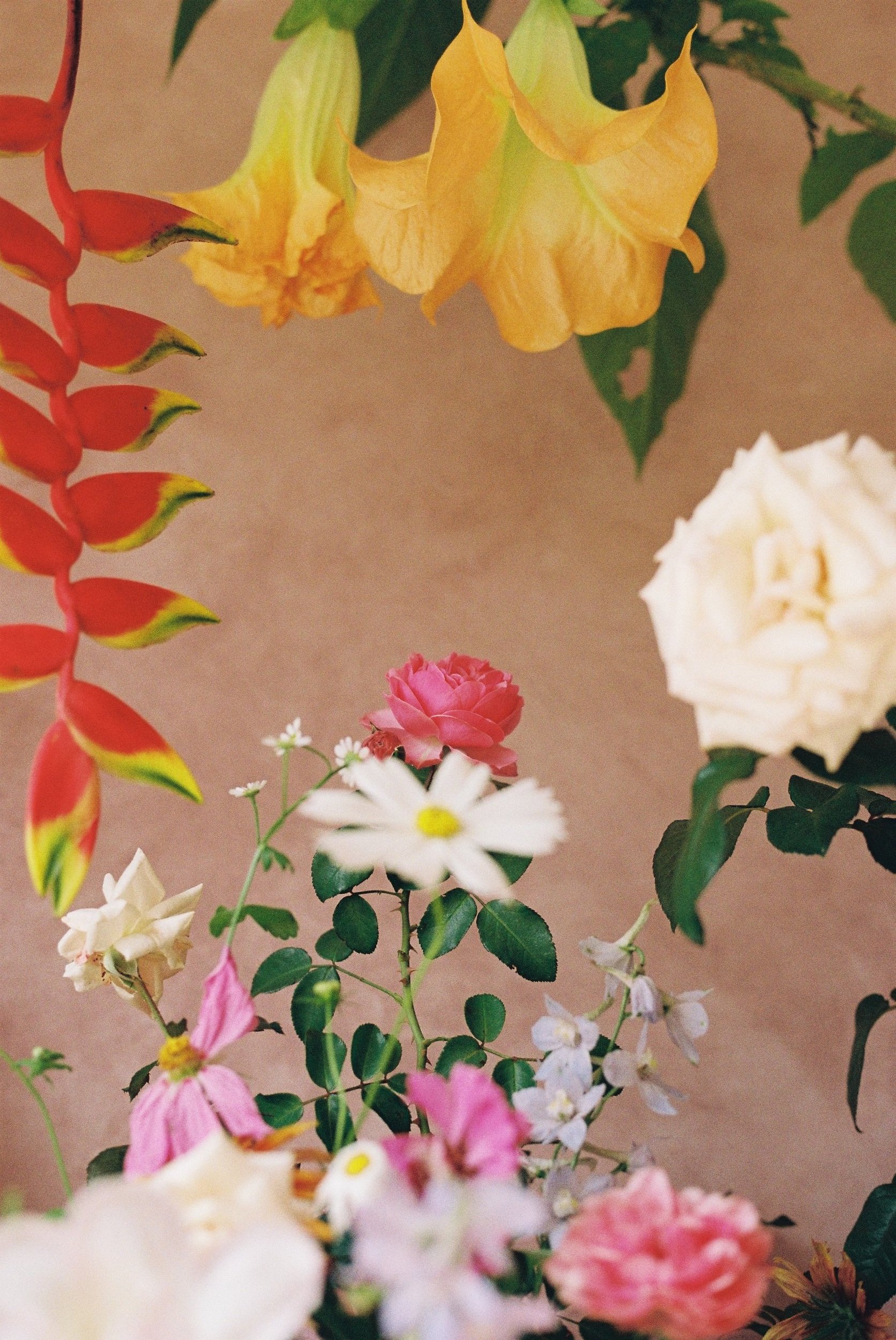
I refer to “Portrait Style Florals", which, for me, basically takes the inspiration from the concept of the floral paintings in which the subject (florals, props, fruits) are taking up all or most of the frame - they evoke fullness, abundance and romance.
This post isn’t about “the rules” of photography and design, but more about my thoughts when I’m arranging and photographing my work.
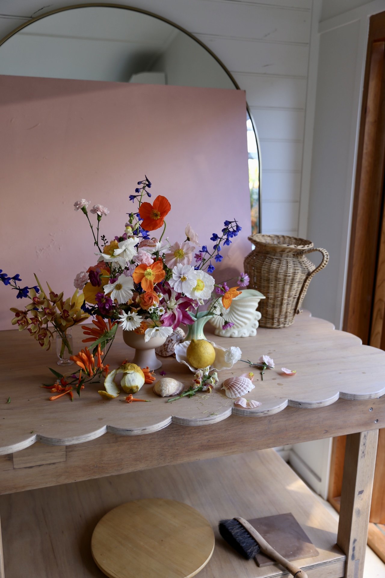
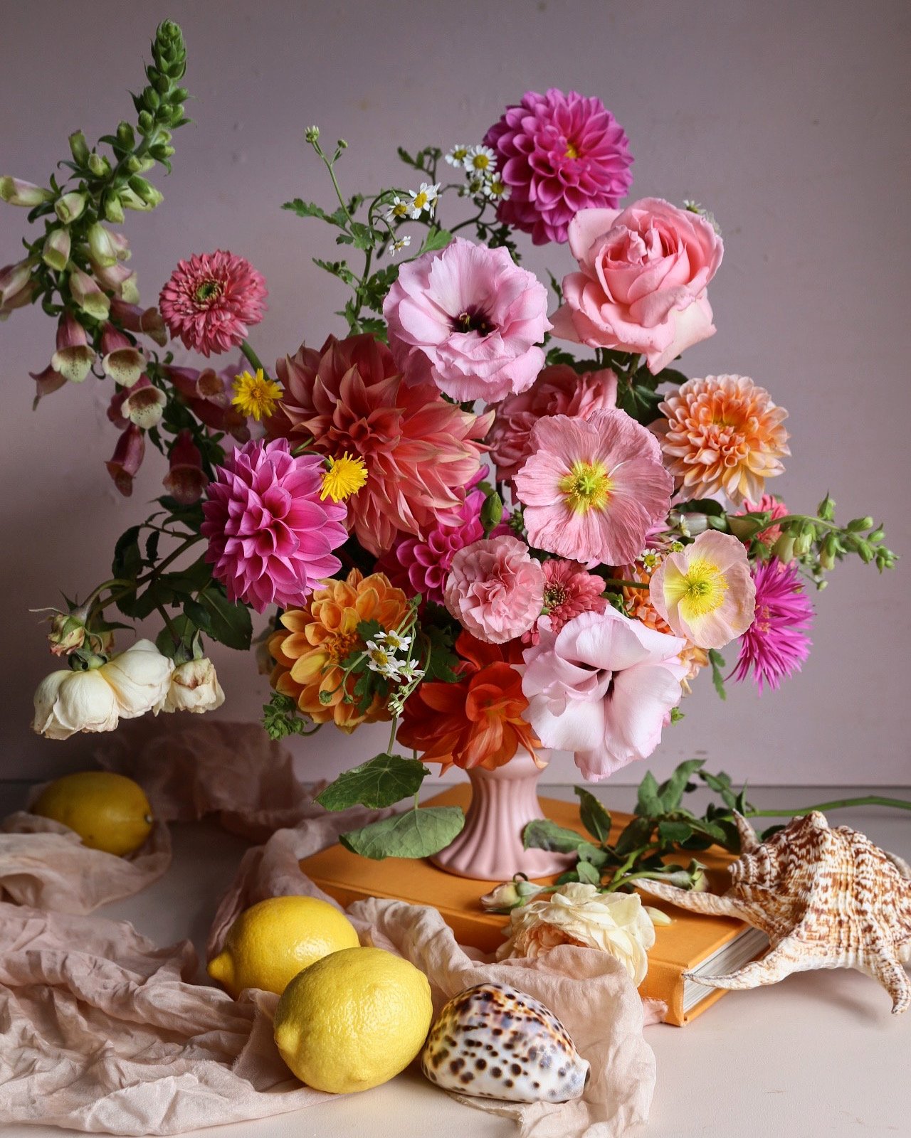

It can be tricky, expensive, and dare I say, sometimes boring (with repetition) to fill the whole frame of an image with just flowers. That's were backdrops, props, risers, plants, and other subtle tricks come into play….
Here are a few ideas to elevate your photos and get more eyes on your work:
1.Don't be afraid to go up -
It doesn't have to be throughout the whole arrangement, but placing some of your stems more vertically in your design, while creating height variation and negative space, will instantly make your design more interesting and bring the viewers eyes on a little journey. I find a lot of my students can be reluctant to go too high when designing. And yes, it can look odd if the flowers in your arrangement are far too out of proportion with your vase. But getting the height just right makes your design (and designing) so much more fun!
If you’re unsure, my advice would be to start by leaving your flowers with a lot of length, when you’re ready pop into your arrangement and walk away, come back a few mins later. Fresh eyes will let you know if the height is right.
2. The more variety in flowers the better -
I say this for pretty much all designs, but if you're wanting a more painterly feel, choose lots of different shapes, sizes, and textures. Lots of variety offers interest in the arrangement/image and gives the viewer so much to look at. These layered elements create an irresistible, dreamy aesthetic.
3. Favour weeds, herbs and curved stems -
Again, just like variety in floral choice, using interesting elements like tomato vines, flowering basil, grasses collected on a walk, and the curvy stems of a cosmos will bring so much life to your design.
Need some inspiration? Pinterest is great, but even better, go outside and let your eyes follow the lay out of a plant in the garden, a rose bush, or go on a walk and notice all the beautiful shapes and textures of nature.
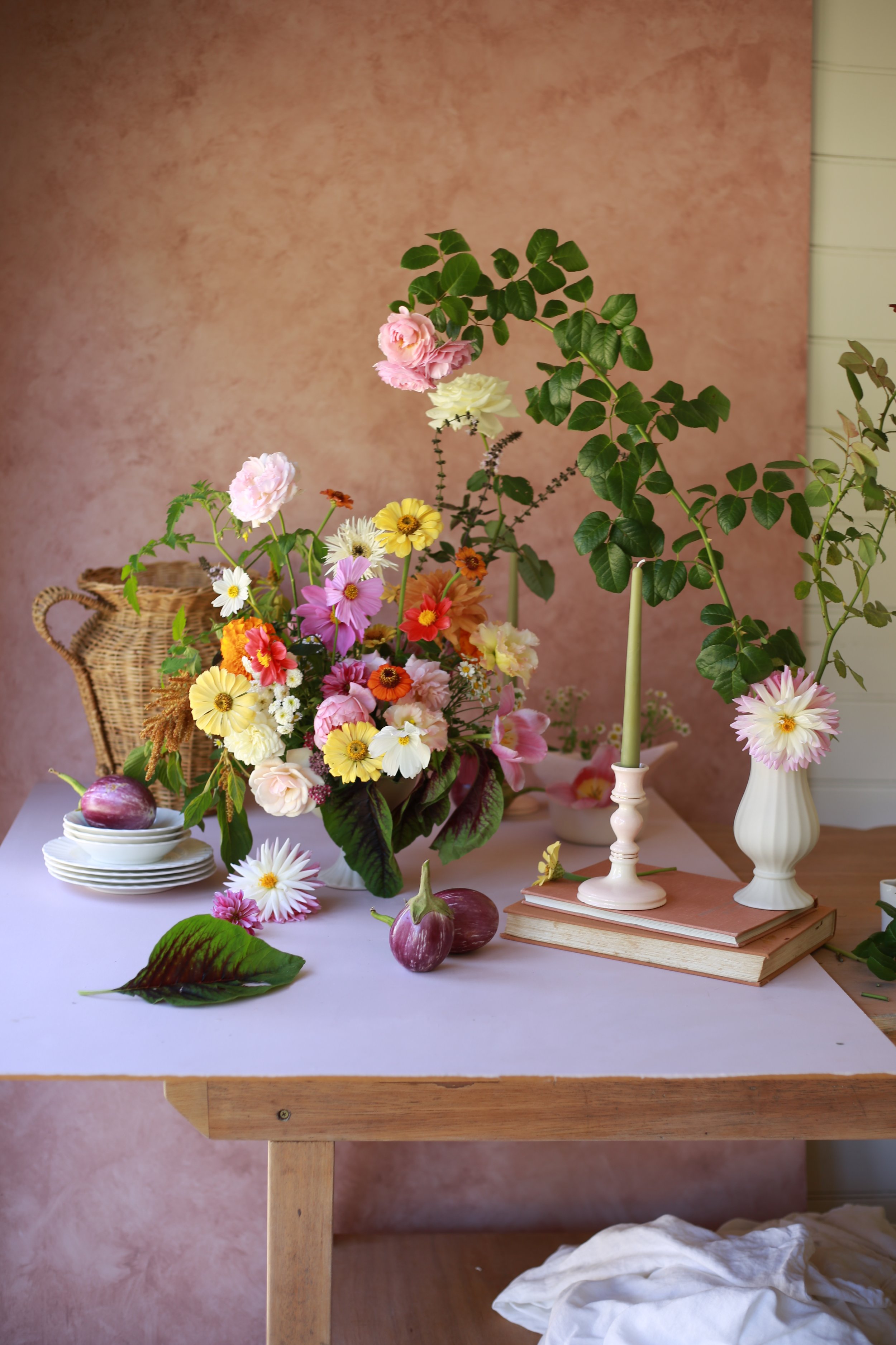
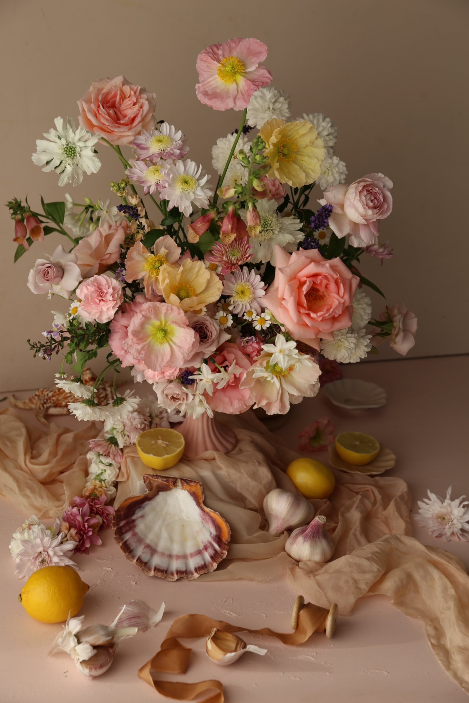
4. Add a backdrop -
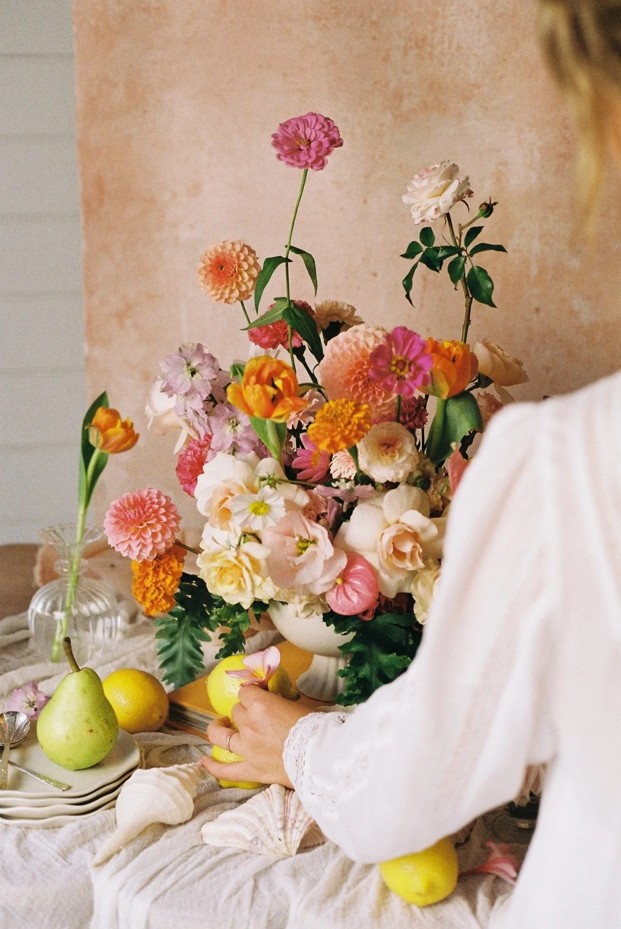
Sheets, painted ply boards, curtains, or paper - adding a background to your photo allows you to fill the frame with colour and texture and can offer completely different aesthetics with which you choose . Pastels, whites and creams will give a more soft and neutral vibe, while a background that offers contrast will really make your design stand out.
5. Play with shadows -
Bring your arrangement away from the wall and let the shadow add some depth to your images.
Try a spot with direct sunlight filtering through and hold up an additional stem to create a shadow on the table or background. Alternatively, create a darker shadow behind your arrangement using a darker coloured background and shooting in a space with natural light from one side.
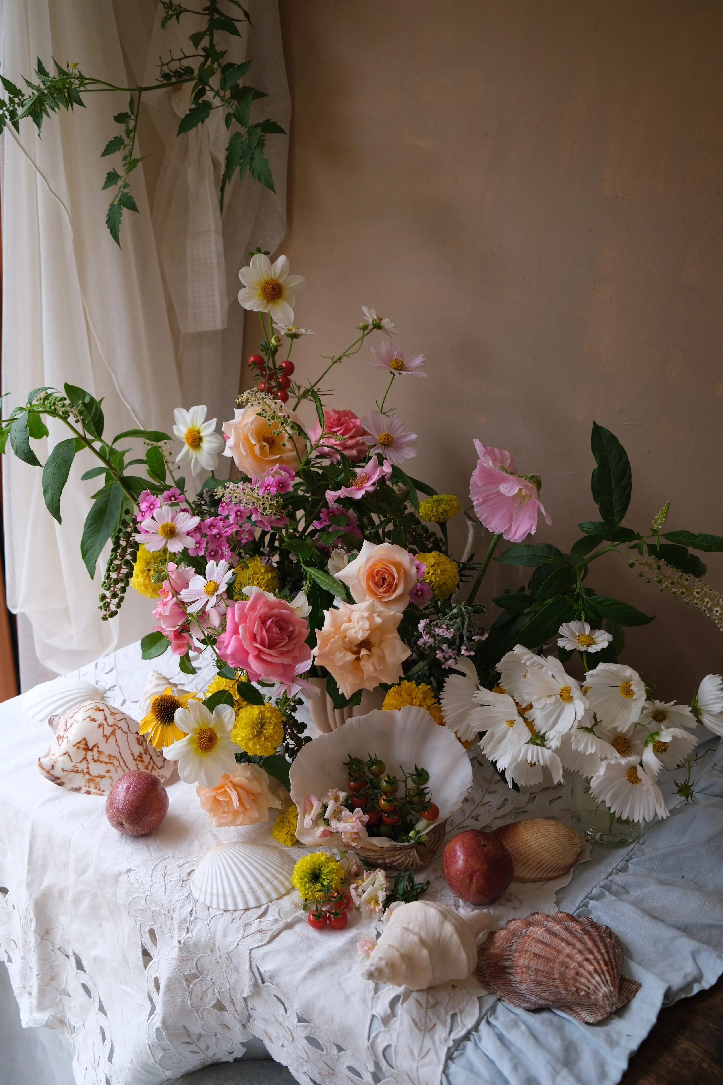
6. Add dimension -
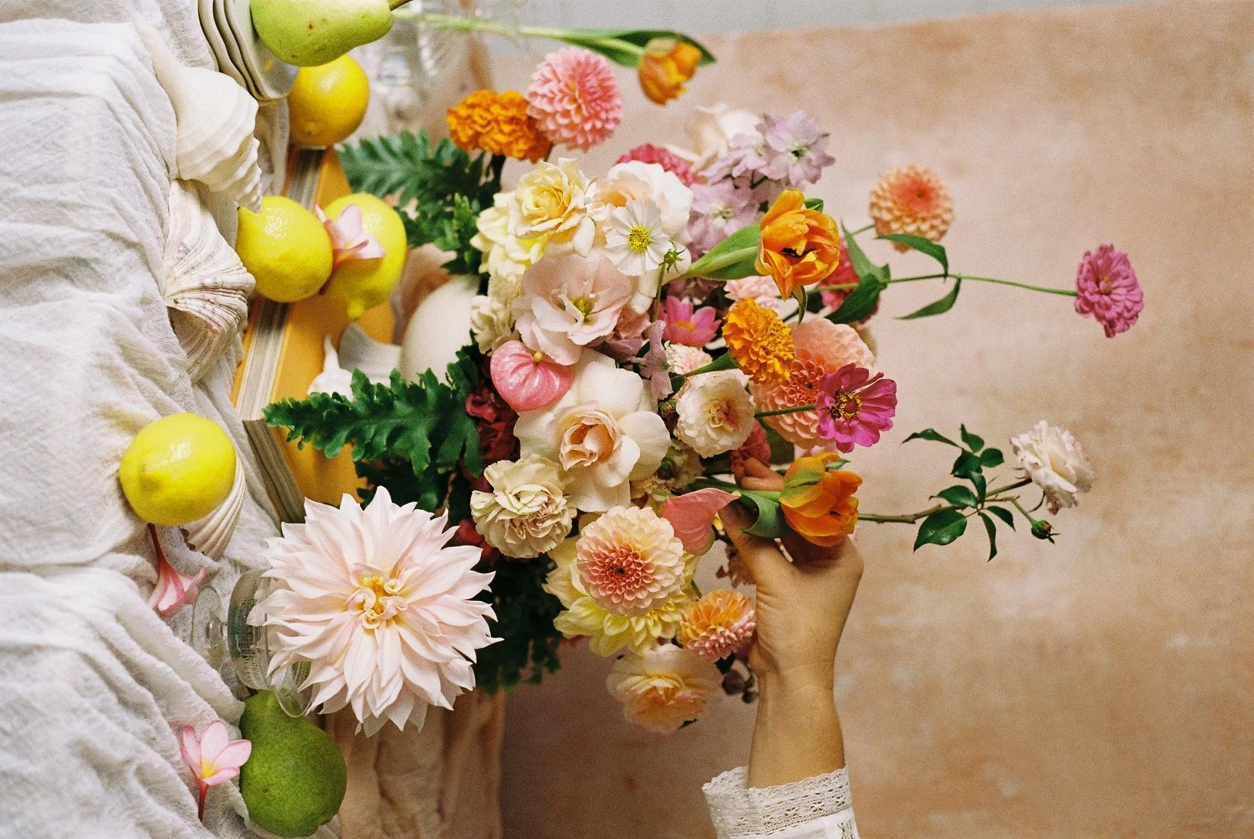
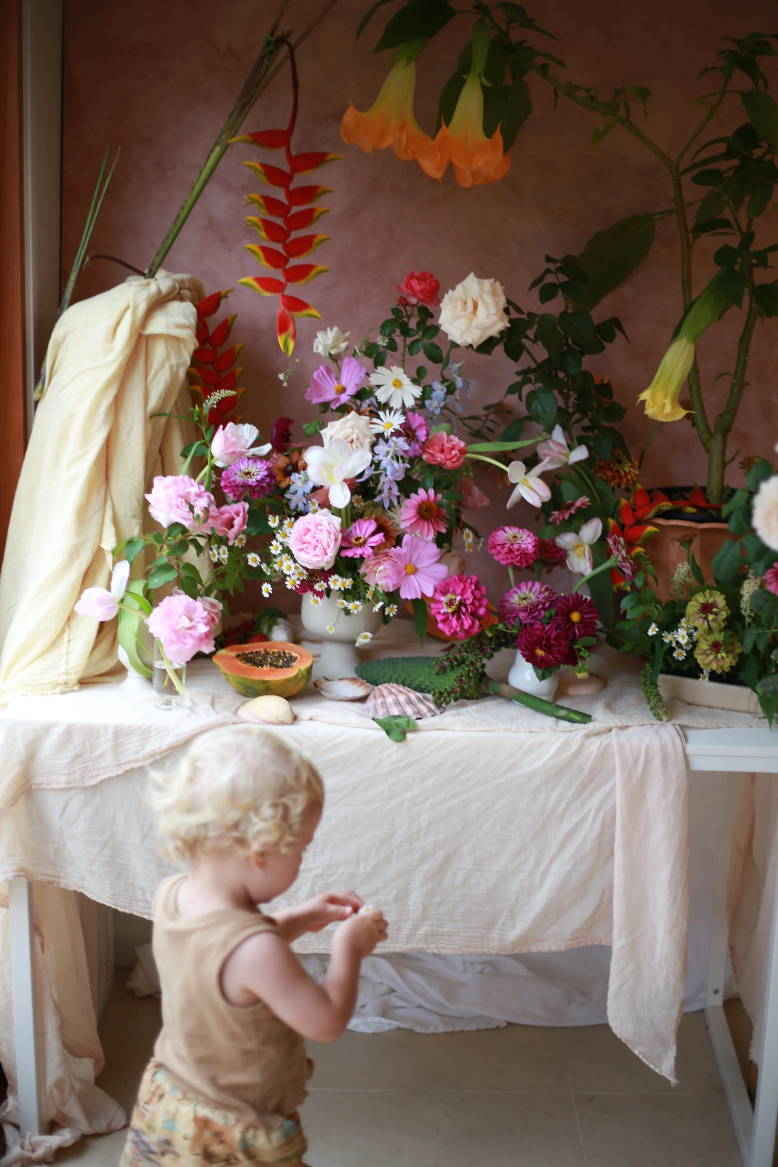
Use flowering plants, taller stems in vases or have someone hold additional flowers into the frame from the side. I often buy amazing plants that I just can’t leave at the nursery or market for this reason. I use them again and again to add another layer and shape to my photos, and when the time comes, they find a spot in the garden.
7. Props, PROPS, PROPS -
I'm (usually) a believer in more is more is more. Layer and stack vintage vases with new pieces, candles, fruits, drape fabric, shells, unravelled spools of ribbon, cutlery, books... anything that feels on brand for your designs, add it in the frame and see how it looks. Don't forget, you can always take it away. So try all the things. When taking your close up photos, you'll want some of these props to be on the edges, with only part of the prop actually making it in the shot.
I hope these were helpful and inspire you.
Let me know your favourite tips in the comments below.
If you’d like to learn more about arranging specifcally for photography and content, take a look at my “Arranging for Photography” class here:
Thanks for being here!
Tanya x
For more design tips check out 5 Botanics for Airy Arrangements.